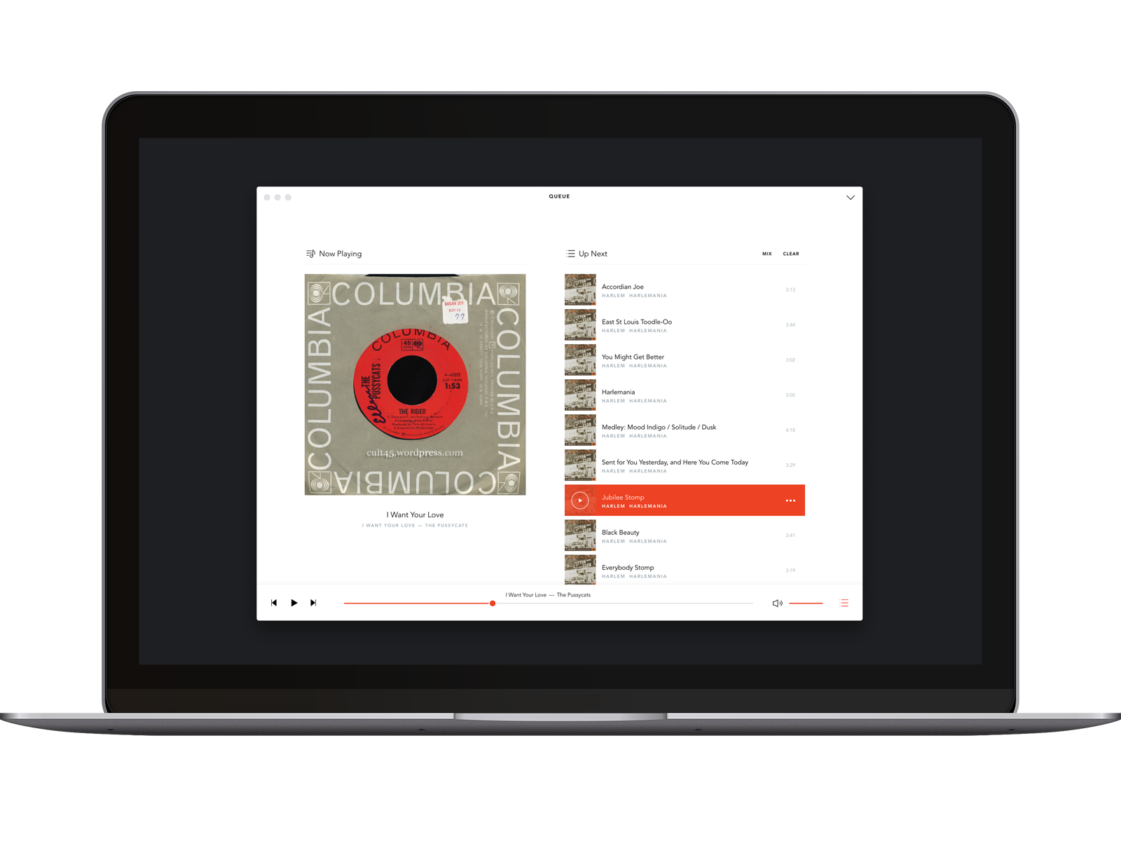
Voltra was a music platform built around a new “stream-to-own” concept. Instead of paying just a subscription fee or buying a song upfront, listeners contributed a small portion of their subscription fee with each stream towards a music purchase. After enough plays, the DRM-free track was theirs to keep.
This model aimed to allow for music discovery while giving listeners ownership of their most-loved tracks — all while sending 100% of music revenue to artists and labels.
I designed the product experience across desktop, mobile, web, and brand. My main challenge was making this new business model feel simple and familiar.
We began by building a desktop music player where users could bring their existing music collections. The goal was to eventually extend it into a streaming platform for music discovery.
It was a difficult technical challenge. Voltra needed to feel fast and lightweight while handling thousands of tracks, different file types, multiple operating systems, and syncing between devices.
Behind the interface, the product had to accommodate:
We also had to clearly explain stream-to-own: what listeners were paying for, how close they were to owning a track, and what happened once it became theirs.
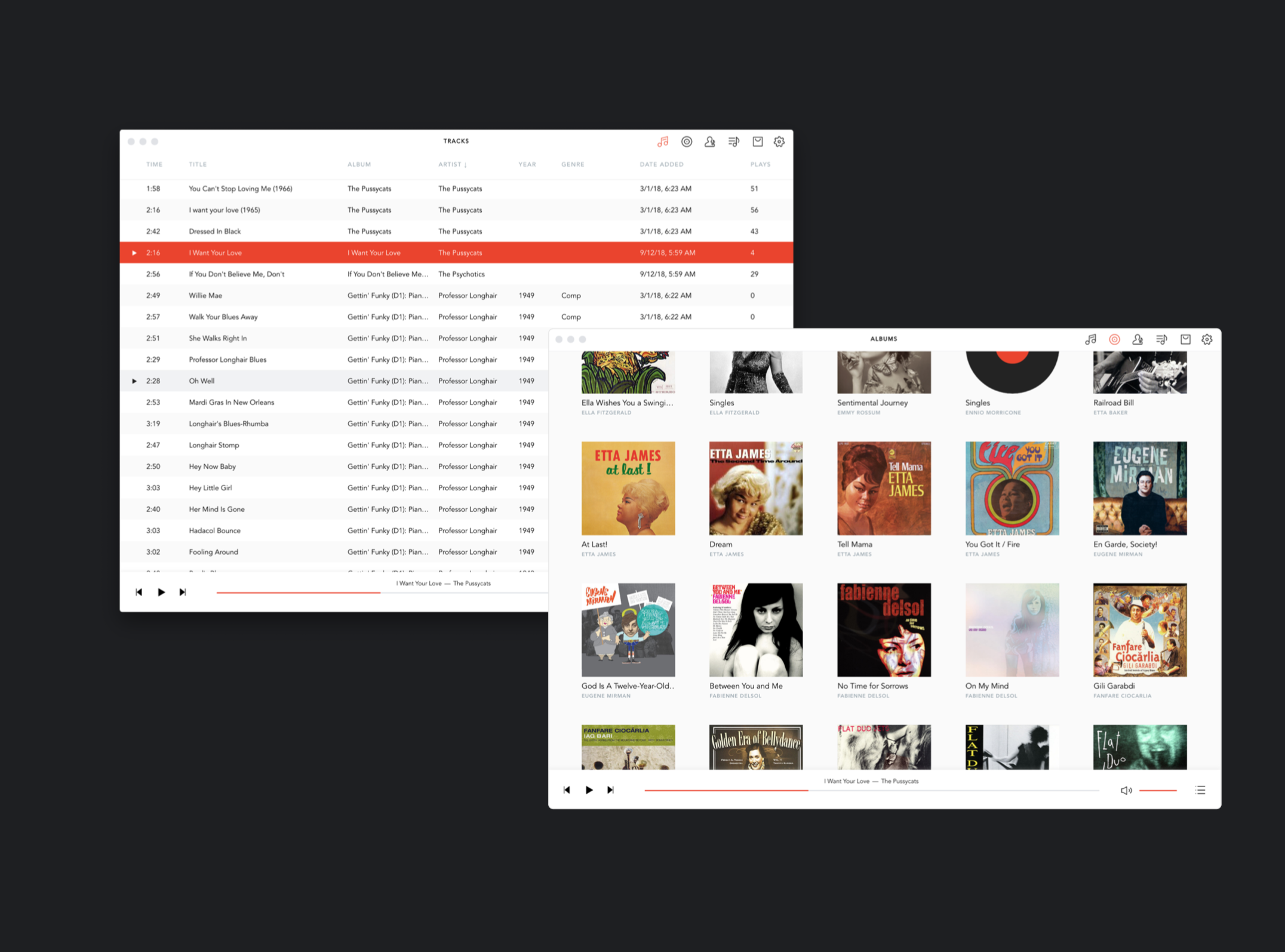
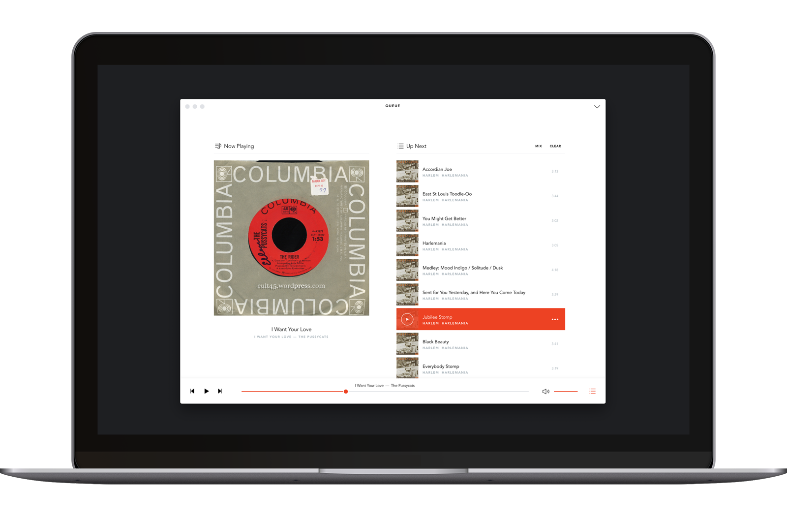
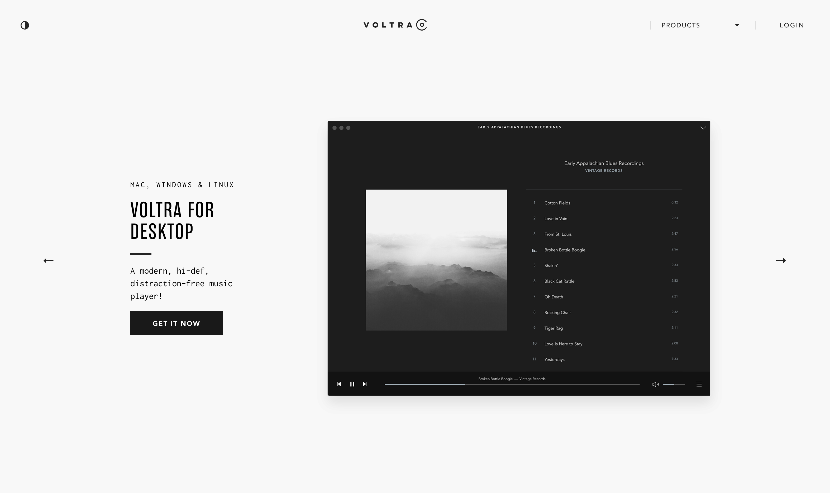
The cross-platform desktop player was the heart of the Voltra experience. I designed it to make large music libraries easy to browse and manage, using a clear hierarchy and a restrained set of interface patterns.
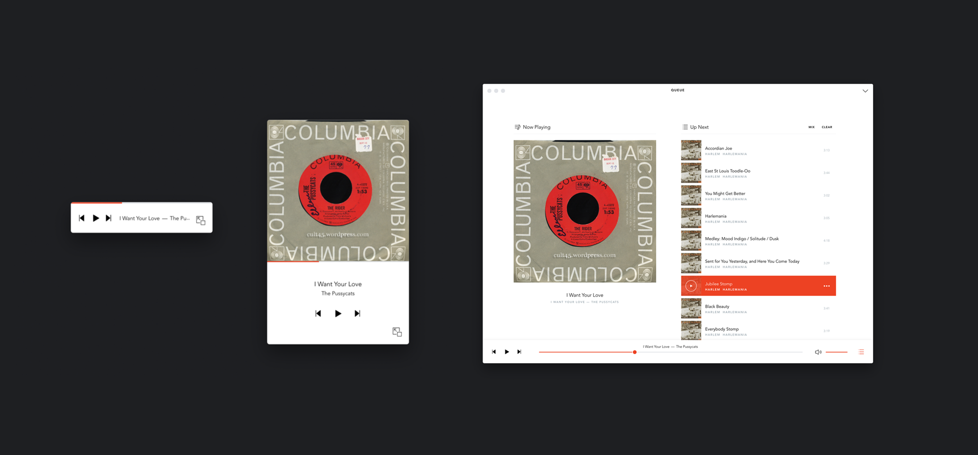
I also created mini and micro modes for quick access to playback controls—a nostalgic nod to players like Winamp. Each used the same design language as the full player, reduced to what was needed in that context.
Because the model was unfamiliar, it needed to be explained through the product itself. We explored different ways of showing the relationship between listening, payment, and ownership.
The aim was to give people enough information to understand their progress without making every stream feel like a transaction.
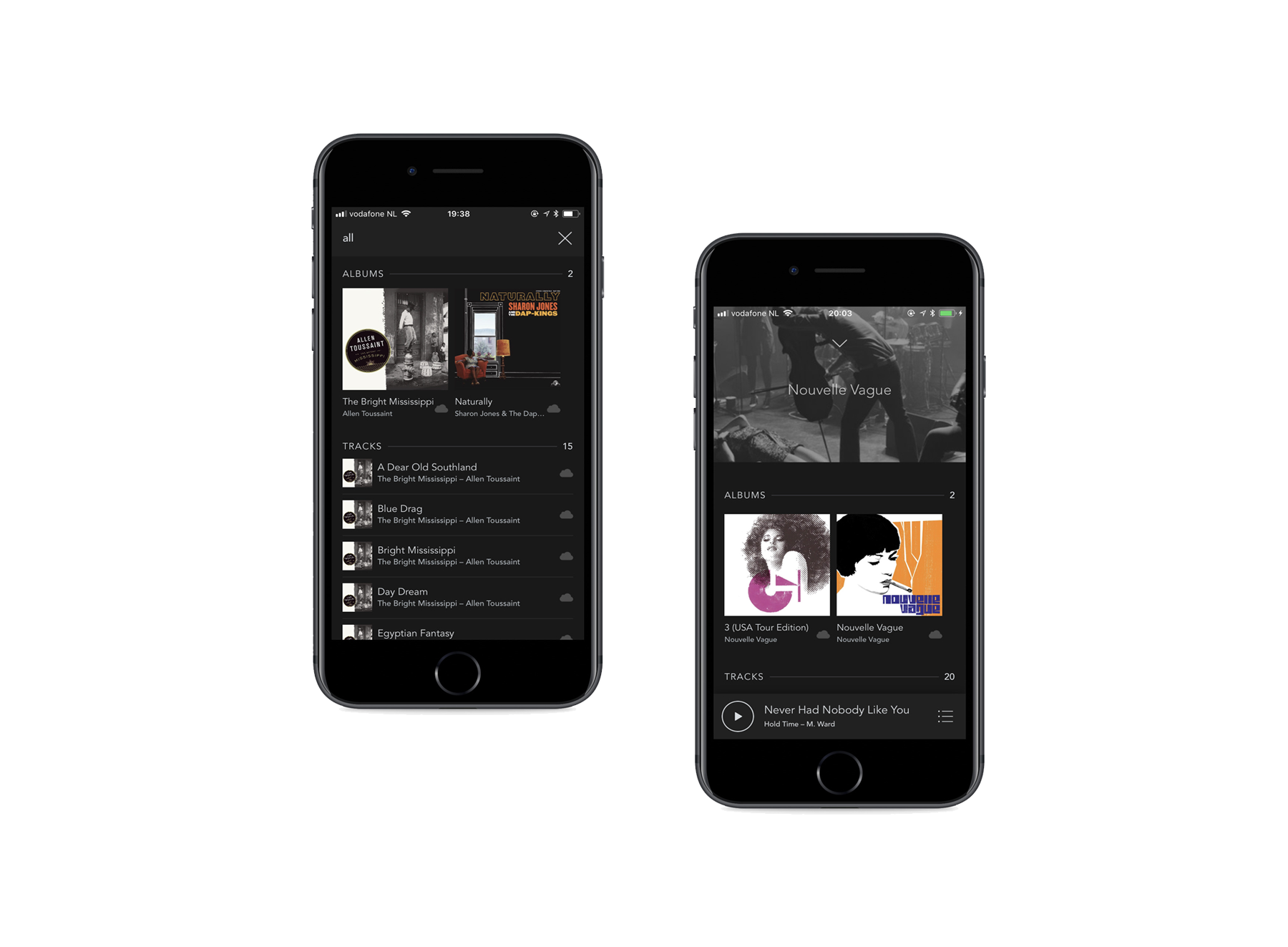
The mobile app let people access music uploaded from the desktop player through the Voltra Audio Archive.
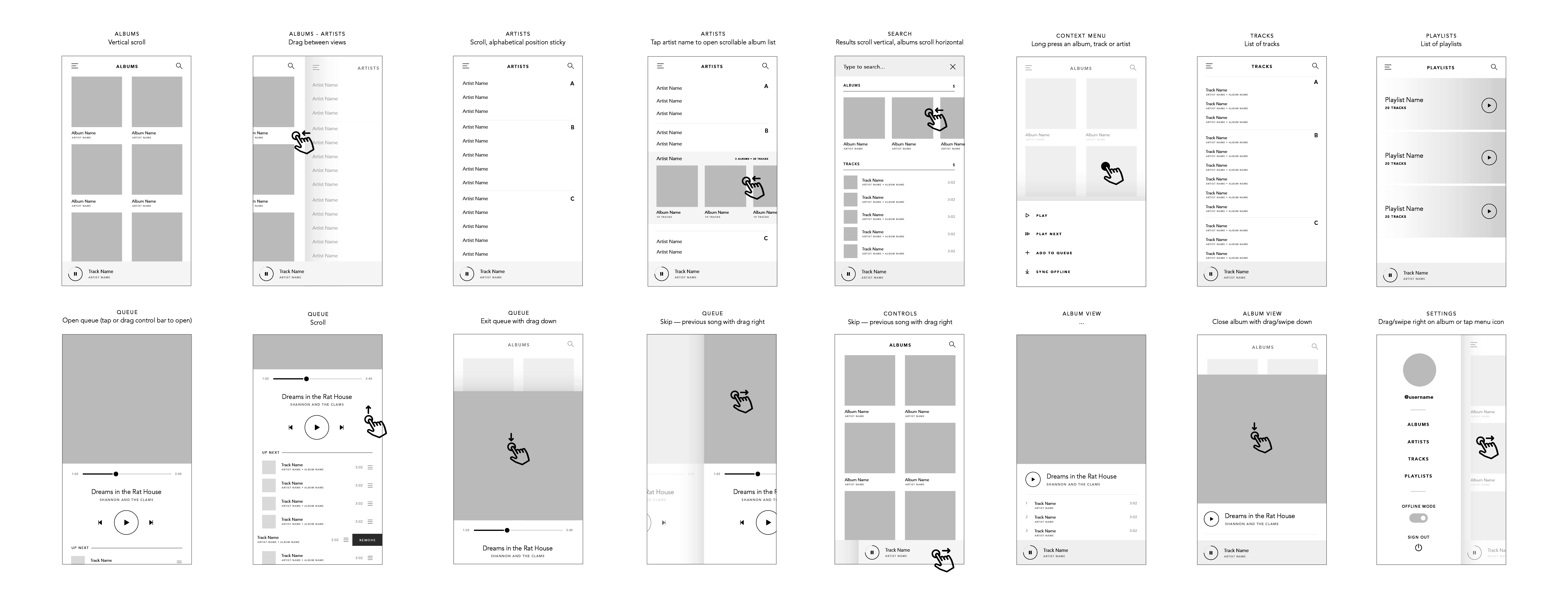
I adapted the desktop experience for touch and smaller screens while keeping the products connected. We compared patterns across iOS and Android, then tested wireframes and coded prototypes to balance familiar platform behavior with Voltra’s own interaction patterns.
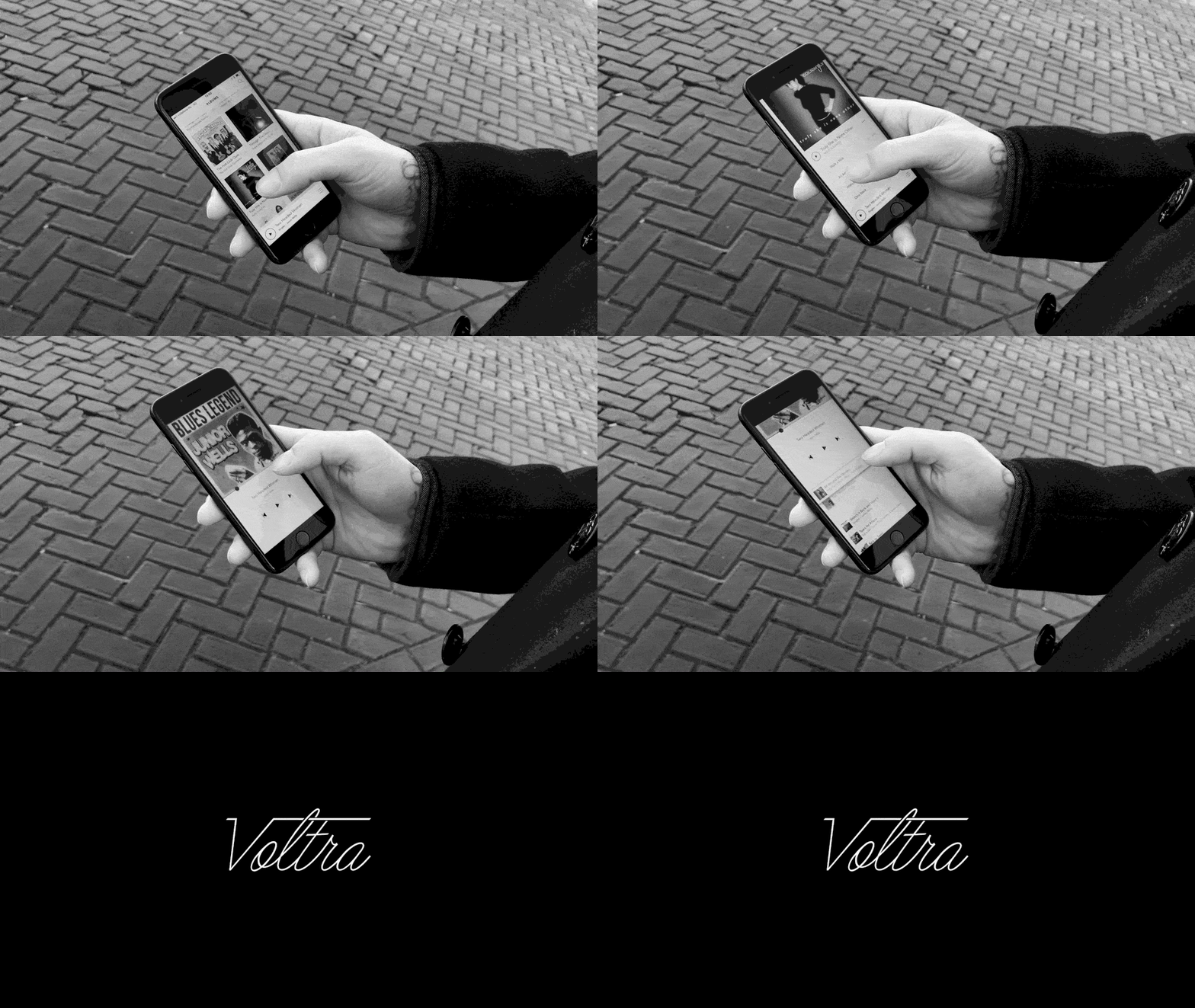
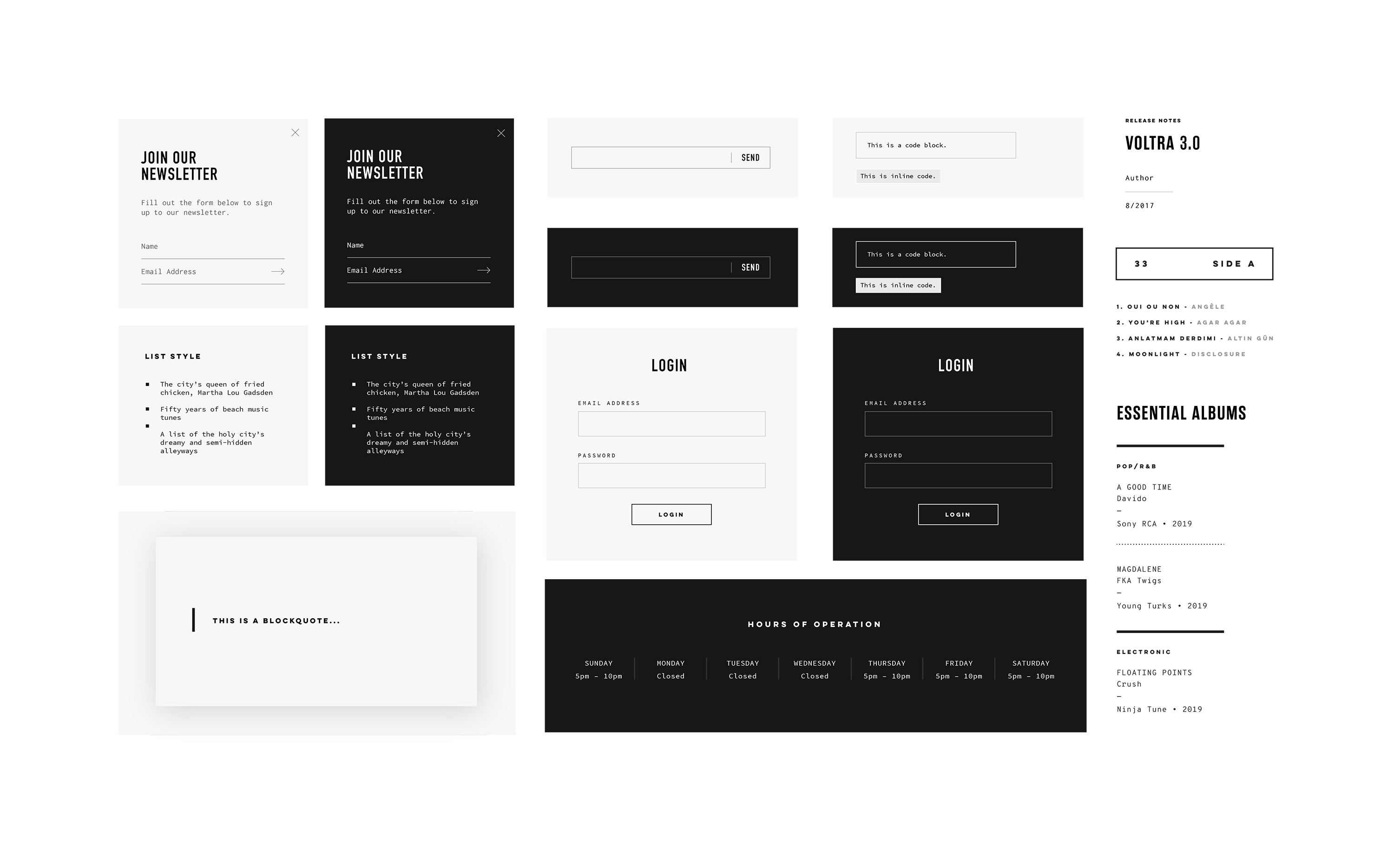
I created a shared visual language across the players, website, and brand. It combined a simple digital interface with references to analog music culture.
A mostly monochromatic palette kept the focus on the music, while accent colors distinguished different parts of the experience. I also designed a reusable icon system for the applications and website.
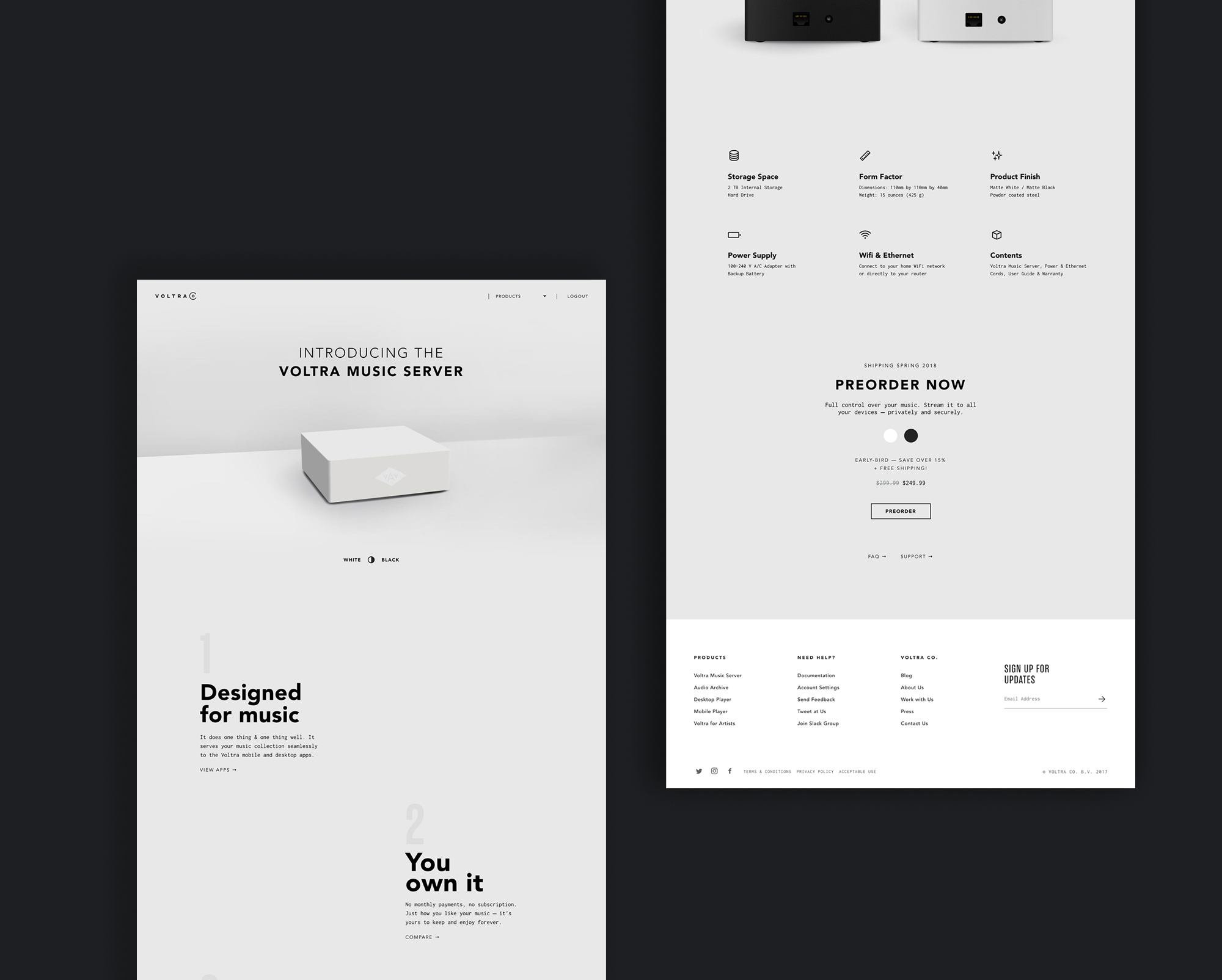
The website followed the same approach: explain the product clearly, encourage people to download the free player, and introduce the paid syncing service.
We refined the product through prototypes, automated and manual testing, and feedback from more than 5,000 beta users.
This helped us improve performance, validate interaction patterns, and identify where the new ownership model needed clearer communication.
Voltra launched in beta, built a loyal early user base, and received coverage from Forbes and the Electron blog.
The company ultimately closed after being unable to compete with larger streaming platforms. The desktop player remained functional, while the cloud-based Audio Archive was phased out.
Although the business didn’t continue, the project showed how an new approach to the music streaming model could potentially be adopted by music fans looking for artist-friendly alternatives.